An Industry 4.0-Based Data Visualization Framework for Improved Manufacturing Data Analysis—A Case Study

An Industry 4.0-Based Data Visualization Framework for Improved Manufacturing Data Analysis—A Case Study

Received: 06 December 2025 Revised: 22 December 2025 Accepted: 08 January 2026 Published: 21 January 2026

© 2026 The authors. This is an open access article under the Creative Commons Attribution 4.0 International License (https://creativecommons.org/licenses/by/4.0/).
1. Introduction
Nowadays, manufacturing firms face new challenges on a daily basis. One challenge is keeping up with the changes in the surrounding environment, such as those attributed to changes in customer preferences, government regulations, and technology. All these changes lead to the existence of fierce competition among manufacturing firms, and to stay successful, firms need to continuously improve their efficiency and productivity, which could be achieved through adopting new emerging paradigms/practices, such as Industry 4.0 technologies.
Industry 4.0 is a notion/initiative that involves technological innovations applied in industrial processes. The term “Industry 4.0”, which was first proposed in 2011 at the Hannover Fair in Germany [1,2], is generally associated with the fourth industrial revolution and with achieving better efficiency, productivity, and automation [1]. Industry 4.0 includes a wide range of technologies/concepts, such as, but not limited to, the Internet of Things (IoT), Cyber-Physical Systems (CPS), Cloud Computing, Big Data Analytics, and Blockchain [1,2,3,4,5,6]. For instance, Big Data Analytics refers to advanced techniques that can extract value from large volumes of data that are too large to be handled using traditional methods [2].
One natural consequence of all such technologies and their integration within the manufacturing environment is a change in the methods used to obtain production data and in the amount of collected data, which is constantly increasing. With the interconnection of different manufacturing equipment and advancements in sensor technology, large amounts of production data can be obtained at an almost continuous rate, replacing periodic manual data collection. As an example, Overall Equipment Effectiveness (OEE) data is typically available in large quantities [7].
While such an abundance of data could be beneficial in optimizing manufacturing processes, suggesting corrective actions, and providing preventive maintenance alerts through online system monitoring, it may also cause accidental inattention to key production data [8]. Moreover, this data could be underutilized or even wasted, despite the investments made in collecting it [9].
Since the goal of any manufacturing firm is to be profitable and competitive, the overarching objective of this research is to improve the efficiency and productivity of manufacturing systems. More specifically, the aim of this paper is to present a straightforward Industry 4.0-based data visualization framework for improved data analysis and potential subsequent decision-making, which simplifies the analysis of big amounts of data collected within manufacturing environments, along with avoiding the accidental neglect of critical information. The key component of the proposed framework is a practical data visualization tool/dashboard that would enable manufacturers to perform better data analysis and intervene promptly when corrective action is needed. While there currently exist many data visualization tools in the academic setting, most researchers do not necessarily integrate the visualization tool within a comprehensive analytical framework that allows: (1) multi-level data exploration through dashboard-based drill down capabilities, and (2) subsequent data-driven decision-making. Furthermore, the proposed work enables manufacturers without software development experience to develop an easy-to-use framework for analyzing their operational data.
It should be noted that the type of collected data considered in this work is the ones related to the efficiency and productivity of the manufacturing system. As a specific application area, Big Data collected for OEE analysis is considered in this work. The OEE metric is one of the most widely used critical metrics in the industrial field, as it summarizes the overall efficiency variables of the machine or even of the whole factory in a single value. Improving the OEE metric value leads to increasing the availability, performance, and quality of the manufacturing system.
This paper is organized as follows: a brief overview of the OEE metric, along with a review of the related efforts in this area, is presented in the following section. Next, the details of the followed approach and the proposed Industry 4.0-based data visualization framework are then discussed in the section after that. In Section 4, the results of implementing this approach in a practical case study are shown. Lastly, the paper concludes and provides ideas for future work in Section 5.
2. Background
In this section, a brief overview of the details of the OEE metric is provided, along with a review of the related efforts that involved the use of different visualization tools to improve the manufacturing systems performance in general and those of the OEE metric in particular.
2.1. The Overall Equipment Effectiveness (OEE) Metric
The Overall Equipment Effectiveness (OEE) metric was developed from the Total Productive Maintenance (TPM) concept launched by Nakajima [10], which aims to increase equipment’s productivity and reduce both maintenance costs and machine breakdowns [11]. The OEE metric is an indispensable performance indicator for manufacturers that identifies the percentage of production time that is actually productive [12]. More specifically, the OEE metric is the product of a machine’s availability, performance, and quality [7,13,14,15,16], as shown in Equation (1). These three factors correspond to downtime, speed, and quality losses, respectively, within manufacturing systems and are typically calculated from different datasets.
The Availability factor represents the fraction of scheduled time that the machine or process is available for manufacturing. It is a measurement of a machine or process uptime after excluding the effects of quality, performance, and downtime events. This factor is calculated from the ratio between the net available time and the planned production time, as shown in Equation (2). The planned production time is also known as the loading time, while the net available time is the total production time minus the downtimes [7,15,17]. The downtimes result from either unplanned stops (e.g., breakdowns) or planned stops (e.g., changeovers) [7]. In other words, the net available time is just the loading time minus the unplanned stops.
The Performance factor represents the efficiency of operating speed, taking into account conditions that cause a production process to run at a speed below normal. As shown in Equation (3), it is the ratio of net operating time to the net available time [7,13,15,17]. The net operating time is the ideal cycle time, which is the minimum cycle time that a process is expected to achieve in ideal circumstances [18], multiplied by the total number of manufactured products.
The final factor, Quality, is a measure of the ability of a machine or process to make good products. As shown in Equation (4), this factor is the ratio between the products that meet quality standards (non-defectives) and the total number of manufactured products [7,13,15,17].
An OEE metric of 100% means that the machine or process is manufacturing only good parts, as fast as possible, and with no downtime. Therefore, measuring the OEE metric and the underlying losses will give an important overview of how the manufacturing system performs across different aspects, along with providing insights into the areas that could be improved.
2.2. Related Work
In the era of the fourth industrial revolution, manufacturing systems have become a data-rich environment, which means that there is an increase in the amount of data available. To maximize productivity and profitability, data-driven decision-making frameworks are needed. The challenging part for manufacturing firms is to find suitable data-driven methodologies to make the collected data more valuable and to utilize dashboards capabilities in a decision support system.
Since the main component of the proposed framework is to provide better visualization of manufacturing data, this sub-section focuses on related efforts in OEE data visualization across different manufacturing environments and presents case studies that demonstrate how the use of appropriate data acquisition and visualization tools can support the firm’s improvement goals and enhance its efficiency and productivity.
Perhaps one of the earliest efforts was in 2007 by Chakravarthy et al., where a map-based approach for data visualization was presented. More specifically, within a semiconductor fabrication plant, a 2D visualization interface was used to direct the manufacturing team to the “flow inhibitors”, where they could spend resources to improve the cycle time. Such an interface was based on combining the Overall Equipment Productivity (OEP), which is just a simple variation of the OEE, with what was referred to as an “X-factor” that provides a measure of overhead time relative to actual processing time [19]. The authors then identified the areas of the plant that require the most attention using the developed interface.
Other efforts included the use of Microsoft Excel for visualization, where the OEE metric and its factors were represented with bar charts. In most cases, the authors used the charts to display a comparison of the metric values before and after proposing an improvement in the manufacturing environment, such as applying quality and Lean manufacturing principles. For example, Suryaprakash et al. applied TPM and Single Minute Exchange of Dies (SMED) within a manufacturing plant producing power steering housings to reduce stoppage times and minor losses, leading to a significant improvement in OEE values [20]. Similarly, Senthilkumar and Nallusamy applied E-Kanban, Just in Time (JIT), and TPM tools within a medium scale rubber moulding unit, to reduce breakdown times and operational costs, and to improve the OEE value [21]. Additionally, within an additive manufacturing environment, Excel was used to visualize the sensitivity of changing a few process parameters, such as the allowable build height, order lead time, and part size variety, on the OEE metric value [22].
More recently, there was a trend towards using more customizable tools, such as Microsoft Power BI software. As an example, an interactive dashboard was developed via Power BI for multiple Key Performance Indicators (KPIs), such as the OEE, Overall Operations Efficiency (OOE), Quality Rate (QR), and Performance Rate (PR), in order to support the decision-making processes within the production departments of a pharmaceutical company in Tunisia [23]. As another example, Power BI was used to develop dashboards within an automated assembly line in a smart manufacturing plant in Thailand, to (1) visualize the OEE metric and the related losses, (2) detect abnormal situations, and (3) try to eliminate the losses using the Kaizen process [24]. More specifically, the authors reported improvements in the OEE metric value and the performance factor from 53.11% to 57.05% and from 78.55% to 84.38%, respectively, by reducing the minor stops from 156 to 78 s [24]. Similarly, Elhabashy and Fors used Power BI to develop an interactive dashboard, not only for the OEE metric and its factors, but also for visualizing other related critical information, such as the different production and stoppage durations and amount of scrap within a given timeframe. Such a dashboard was applied to a case-study within a manufacturing setting in Egypt and provided recommendations for OEE improvement to practitioners [25]. This study, however, didn’t include a structured framework for developing the dashboard to improve data analysis and subsequent decision-making.
It should be noted that some researchers also used the same software, but for other types of data. For example, dashboards were developed using Power BI to visualize operational data related to quality deviations during products’ assembly and to present detailed information about stop times and quality remarks. These dashboards were used to detect and analyse problems in the assembly lines [26]. In addition, research has been conducted on OEE data visualization using other software tools. For instance, MATLAB was used to develop a visualization dashboard for a smart lathe’s various machine-related data, including OEE information, which would allow for real-time monitoring of the machine’s status [27].
From these examples, it is apparent that researchers focused on providing visualization of different data for the sake of improving the efficiency and productivity of manufacturing systems. Despite being a critical step towards better decision-making, a visualization tool that facilitates straightforward analysis is still needed. Hence, the work presented here can be considered as an extension to other researchers’ efforts in this area, where the visualization tool is part of a larger comprehensive framework for improved data analysis and potential subsequent decision-making. Such a framework, which allows practitioners to go beyond just data visualization, is discussed in detail in the following section.
3. Materials and Methods
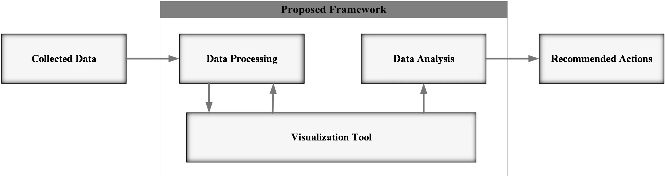
The aim of this work is to transform the abundant manufacturing Big Data into useful information, provide manufacturers with visual tools, and support better subsequent decision-making, thereby increasing productivity and competitiveness while preventing the accidental neglect of critical information. This aim will be achieved through a straightforward Industry 4.0-based data visualization framework for developing dashboards, which aids with data analysis. The inputs and outputs of this framework are depicted in Figure 1 and discussed in the following subsections; the arrows represent the flow among its components. For instance, the collected data is fed into the “Data Processing” component, while the analyzed data is used to provide recommendations.
3.1. Data Specification and Collection
The input of the proposed framework is the collected data that needs to be analyzed. The manufacturer needs to first identify the data of interest, which could be related to a certain KPI. For instance, to analyze the OEE metric, the data relating to availability, performance, and quality of the considered processes/machines is required. After specifying the required data, the actual data must be collected. The manufacturer would need to determine the data collection frequency (how often to collect data) and how the data will be collected (semi-automatically, automatically using perhaps in-process sensors, etc.).
3.2. Data Processing
The first component of the proposed framework is data processing, as the collected data may contain irregularities and/or irrelevant data (out of scope) that needs to be removed. The collected data needs to be checked if it contains duplicates, missing values, or other issues. In addition, the collected data might need a change in structure (reorganization), such as converting the data from being in rows to columns or vice versa, so that the visualization tool could handle it easily.
3.3. The Visualization Tool
After the data has been processed, the next component in the proposed framework is a tool for data visualization through graphs and other displays. The main goal of this visualization tool is to provide manufacturers with displays (in the form of dashboards), to aid them with (1) monitoring manufacturing equipment, (2) better understanding of the manufacturing system’s interrelationships, (3) assessing the system’s performance, and (4) promptly intervening with corrective actions when needed.
It should be noted that while developing the dashboards/displays, further data processing may be required; hence, there is mutual interaction between the data processing and visualization tool components as shown in Figure 1. In addition, the processed data is not analyzed directly, without going through the “Visualization Tool” component. It is through this visualization, more insights are obtained and better recommendations can be made.
3.4. Data Analysis and Recommended Actions
The final component of the proposed framework is responsible for analyzing the data displayed in the visualization tool. The aim here is to provide manufacturers with useful insights about the production system. For example, data analysis could highlight losses that delay the production processes or recurring maintenance issues.
Using the visualization tool, developed by suitable software, manufacturers would be able to perform different types of analyses. Based on such analyses, different actions can be recommended, either to improve the production system or to remedy current issues, as an output of the proposed framework. It should be noted that both the visualization tool and the data analysis components of the proposed framework are intended to help manufacturers make more accurate decisions about the manufacturing environment.
4. Case Study
4.1. Company Overview
The framework discussed in the previous section has been applied to a single machine in a tire manufacturing company in Egypt. This tire manufacturing company is a leading international company in manufacturing and commercializing branded truck, bus, agricultural vehicles, and off the road tires. The machine considered in this work is the one responsible for fabricating the tire bead. This machine is used to manufacture three different tire sizes (7 by 5, 7 by 6, and 7 by 7). In addition, the machine can be customized for other types of tires that endure high loads.
4.2. Proposed Framework Implementation
4.2.1. Data Specification and Collection
The company is interested in collecting and analyzing data related to the OEE metric. In order to calculate the three factors used in computing the OEE metric, the necessary generic data for the analysis were first identified, including the number of shifts, duration of each shift, planned stops duration, etc. Then, the required inputs for analysing the studied machine were determined, including the number of manufactured products, the amount of scrap, the duration of unplanned stops, etc.
Some of this data is straightforward to identify, such as the number of working shifts, while others may require calculations to determine. As an example of the latter, the planned stops include stoppage time for adjusting the machine to switch products before work and for lunch and coffee breaks, whereas unplanned stops include stops for breakdowns and for both electrical and mechanical defects.
The data collection process was completed by the company, where they provided the OEE related data for two months, but only one (January of 2021) was used just as a proof-of-concept pilot study. A sample of such data is provided in Table 1, where the data is displayed for three shifts (I, II, and III) across three random days (X, Y, and Z), as a sample of the situation before applying the proposed visualization framework.
Table 1. A condensed sample of the given OEE related data for three random days (before applying the framework and better visualization).
|
Day |
X |
Y |
Z |
||||||
|---|---|---|---|---|---|---|---|---|---|
|
Shift |
I |
II |
III |
I |
II |
III |
I |
II |
III |
|
Planned Stops (minutes) |
30 |
60 |
480 |
60 |
60 |
480 |
60 |
60 |
60 |
|
Loading Time (minutes) |
450 |
420 |
- |
420 |
420 |
- |
420 |
420 |
420 |
|
Unplanned Stops (minutes) |
56 |
121 |
- |
79 |
39 |
- |
152 |
18 |
153 |
|
Scrapped Units |
- |
4 |
- |
4.2 |
4 |
- |
9 |
10 |
- |
|
Available Time (minutes) |
394 |
299 |
- |
341 |
381 |
- |
268 |
402 |
267 |
|
Availability Rate (%) |
88 |
71 |
- |
81 |
91 |
- |
64 |
96 |
64 |
|
Performance Rate (%) |
90 |
94 |
- |
96 |
93 |
- |
81 |
100 |
89 |
|
Quality Rate (%) |
100 |
97 |
- |
97 |
99 |
- |
92 |
95 |
100 |
|
OEE (%) |
79 |
65 |
- |
76 |
84 |
- |
48 |
90 |
56 |
The original data included all the daily expected different types of planned and unplanned stops for every shift, and the calculations of different times. It should be noted that with the ongoing advancements in sensing technology, it is expected to be able to collect data more frequently; yet, the framework should still be able to handle larger sizes of data.
4.2.2. Data Processing
The data provided by the company was in a format that did not allow it to be easily visualized or analyzed in the following steps, and it also contained duplicates and errors, such as missing values. It is believed that the errors may have originated in the data collection method, including manual data entry into worksheets/spreadsheets and rounding up numbers, which may have caused some miscalculations.
As a result, the data was reorganized and stacked into columns, as the ones shown in Table 2, to make it easier to extract the most important information from within. In addition, the calculations performed on the provided dataset were reevaluated to ensure their correctness. Such data processing was done using Microsoft Excel, since it allows quick calculations, is user-friendly, is a commonly used tool for data processing, and contains a wide range of built-in functions that were extremely useful in this step.
Table 2. A sample of the reorganized and recalculated data for one day.
|
Day |
Shift |
Availability (%) |
Performance (%) |
Quality (%) |
OEE (%) |
|---|---|---|---|---|---|
|
Z |
I |
64 |
81 |
92 |
48 |
|
II |
96 |
100 |
95 |
91 |
|
|
III |
64 |
89 |
100 |
57 |
4.2.3. Data Visualization
After processing the data, visual displays in the form of a dashboard were built using Microsoft Power BI (Version: 2.149.1429.0) to get insights and some statistics for a better understanding of the current situation and highlighting the areas of potential improvement. Excel was not used here, as it would not have been as effective. Instead, Power BI was used because it: (1) provides better visual displays, (2) has the option of alerting users when specific metric values changes, (3) is a great option for building visual dashboards containing different KPIs, (4) allows interactivity through different filtering options, and (5) has been successfully used for similar applications by other researchers (as discussed in Section 2.2). Despite these advantages, it should be noted that Power BI is not necessarily effective for data processing and, therefore, was not used for that component in the proposed framework.
The developed dashboard includes two interfaces, a main and a secondary one. The main interface provides aggregate information, whereas the secondary interface provides detailed information. These two interfaces are shown in Figure 2 and Figure 3, respectively. These figures are showing data related to only the 3rd shift over one month, as part of the proof-of-concept pilot case-study. The descriptions of the components/visual displays in both interfaces are provided in Table 3. While this data is currently static, dynamic data that would be updated frequently, every shift, for example, could be easily integrated within to provide more up-to-date information.
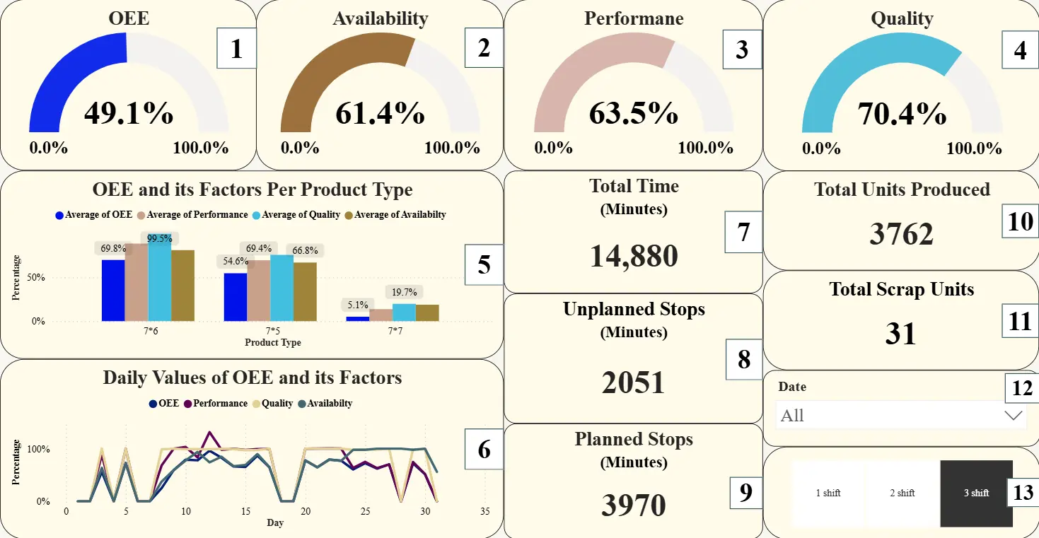
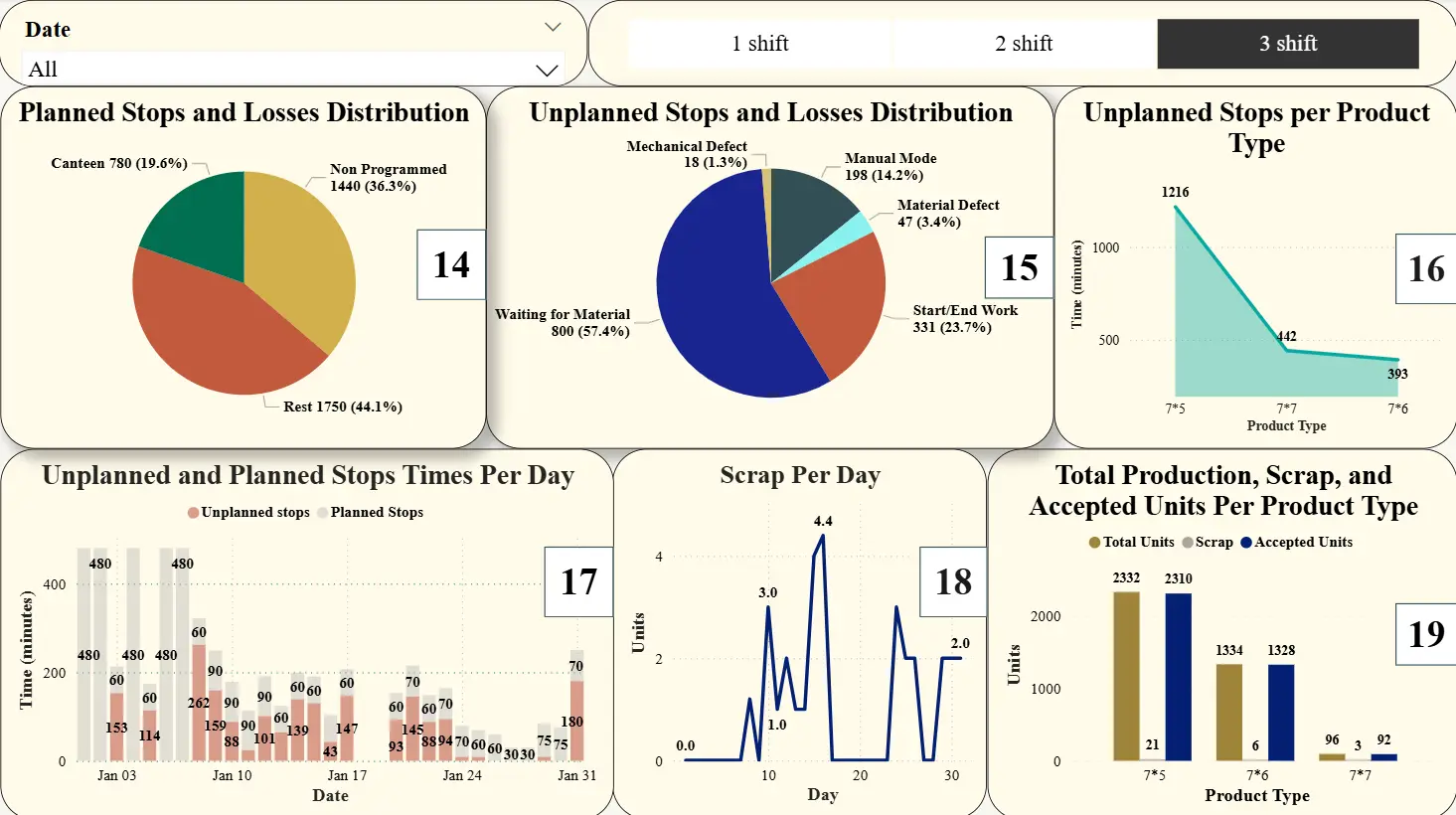
Table 3. Description of the dashboards’ components/visual displays.
|
# |
Description |
|---|---|
|
1 |
The average OEE value |
|
2 |
The average Availability factor value |
|
3 |
The average Performance factor value |
|
4 |
The average Quality factor value |
|
5 |
The average value of the OEE and its three factors for each product type |
|
6 |
The daily values of the OEE and its three factors |
|
7 |
Total production time |
|
8 |
Total unplanned stoppage time |
|
9 |
Total planned stoppage time |
|
10 |
Total number of units produced |
|
11 |
Total number of scrapped units |
|
12 |
Date filter |
|
13 |
Shift filter |
|
14 |
The losses distribution of the planned stops |
|
15 |
The losses distribution of the unplanned stops |
|
16 |
The duration of the unplanned stoppage times for each product type |
|
17 |
The daily duration of the unplanned and planned stoppage times |
|
18 |
The daily values of the scrapped units |
|
19 |
The number of produced, scrapped, and accepted units for each product type |
The different visual displays were included to provide in-depth insights about the machine considered.
-
-
Total count visuals: Displays 10 and 11 illustrate the production quantity and scrap rate of the machine in terms of the number of units produced and the total scrapped units, respectively.
-
-
Time visuals: These visuals show the total, unplanned stoppage, and planned stoppage times of the machine (displays 7, 8, and 9, respectively).
-
-
Product type visuals: These visuals show the OEE and its factors for each product type (display 5), the unplanned stoppage times per product type (display 16), and the total units produced for each product type, along with the accepted and scrapped units (display 19).
-
-
Daily values visuals: These visuals help in monitoring the daily values of the OEE and its three factors for the machine, the critical times of the machine, including the unplanned stoppage and planned stoppage times per day, and the daily number of scrapped units from the machine (displays 6, 17, and 18, respectively).
-
-
Losses distribution visuals: These visuals help identify the different types of losses that cause planned and unplanned stoppage times, along with their proportions (see displays 14 and 15, respectively). From these visuals, it can be concluded which losses have the greatest negative effect on the OEE value and should have higher priority for reduction (or elimination, if possible).
4.2.4. Data Analysis and Recommendations
Using the visual displays within both interfaces, the collected data can now be more effectively analyzed and the factors impacting the OEE value the most can be easily identified. In general, the OEE metric is affected to a great extent by the planned and unplanned stoppage times and the number of scrapped units, as clarified next.
-
-
OEE Factors: As presented in the main interface (displays 2, 3, and 4), any change in each of the three factors will consequently affect the OEE value. More specifically, the Availability factor has the most negative impact on the OEE in the presented case. Such a negative impact could be attributed due to the existence of frequent planned and unplanned stops that make the available time of the machine less than the planned working times. Reducing the stoppage times is a must to increase the availability and performance of the machine and consequently the OEE values. In addition, reducing the number of scrapped units will improve the Quality factor and, in turn, enhance OEE values.
-
-
Planned Stops: As shown in the main interface (display 9), the total time of the planned stops in shift 3 over one month was more than 2 and a half days. When all shifts are considered, the total duration of the planned stops was 8845 minutes representing 19.8% of the total time (around 6 days). This number, which is obtained by summing all the planned stops values across the three shifts, is an important indicator showing the large losses in the availability of the machine considered due to the planned stops. It was noticed, from display 14, that the main planned stops in all shifts were rest (lunch breaks), canteen (coffee breaks), non-programmed times (time for adjusting the machine at the beginning of the shift in case of producing different products), and planned absences, respectively.
Although the first two losses represent food and drink breaks, they could still be reduced by splitting them into two shorter breaks at different times during a shift, rather than just one. Each operator will be assigned to one of the breaks. In this manner, machines would be operational for longer periods of time, and their supervision would be the responsibility of the operators working while their colleagues are having their break.
For the non-programmed time losses, they can be reduced by training the employees to adjust the machines in a shorter time or by applying a strategy for reducing the changeover time through creating a production plan that guarantees manufacturing products on specific machines without the need for changing tools (if possible). For the planned absences, appropriate labor scheduling is needed to avoid having planned absences for the same positions on the same day, along with perhaps enforcing a maximum limit on the number of the operators that could be absent (excluding sick leaves) on any day.
-
-
Unplanned Stops: As seen in the main interface (display 8), the total time of the unplanned stops in shift 3 over one month was over a day. When all shifts are considered, the total duration of unplanned stops was 6169 minutes, which was obtained by summing all the unplanned stops values across the three shifts, representing 13.8% of the total time (around 4 days). The main unplanned stops could be observed from display 15. The top four observed unplanned stops in all shifts were waiting for material, breakdowns, start/end work, and setup time. Regarding time loss due to waiting for material, it is recommended to apply Lean manufacturing principles/tools, such as TPM, Lean Six Sigma (LSS) methodologies, Value Stream Mapping (VSM), and the 5S (Sort, Sweep, Standardize, Shine, and Sustain) [28,29,30,31], to provide the required material for the machine at the right time. As for the unexpected breakdowns, they could be reduced through applying a rigorous maintenance program that implements preventive maintenance regularly, along with perhaps performing a quick inspection on the machine status at the beginning of each shift (if cost-effective). With respect to start/end work losses, which are usually due to unnecessary delay by operators at the start or end of operations, they could be reduced by rewarding operators based on the number of products they complete per shift, as an additional incentive. Finally, the setup time losses could be reduced by applying the SMED concept.
-
-
Scrap: In the second interface, the number of scrapped units of each product is presented in display 19 for the third shift. When all shifts are considered, it was noticed that product type 7 by 5 has the largest number of scrapped units compared to other types. Accordingly, it is recommended to perform a fishbone diagram, the five whys method, and/or any other type of analysis to reveal the main causes for producing the defective units in this product type and for the other products as well, to reduce or even eliminate them completely. Furthermore, these problem-solving techniques could be used to study the main causes of the number of scrapped units being higher on certain days than on others (as shown in display 18).
In addition to such recommendations, it is also suggested to enhance the data collection method within the company, as it affects the visualized and analyzed data in the proposed framework. Since improving data acquisition methods will enhance analysis accuracy and yield more reliable insights, it is recommended that the data collection method be at least semi-automated, if not fully automated. In semi-automated data collection systems, reports are usually filled and sent by certain operators at the end of each shift, and the data included in the reports is fed into the system, which processes the data, resulting in graphical outputs. While the automated data collection system will allow real-time monitoring of the production system, which could help in (1) identifying hidden production capacities for better utilization of production machines, (2) justifying investments into new machines, and (3) providing more accurate maintenance schedule and OEE measurement settings.
Furthermore, the company could benefit from incorporating additional Industry 4.0 technologies, such as automatic transportation of items and robotic arms, to reduce unnecessary waiting times, which could lead to improving the OEE metric. Not only that, but the company could also benefit from the Industrial Internet of Things (IIoT) concept by providing the machines with sensors and/or cameras to monitor critical variables. This concept would allow for automating data collection, help with improving the quality of collected data, and potentially enable real-time information on different process variables and used material status.
5. Conclusions and Future Work
In this work, an Industry 4.0-based data visualization framework was proposed for improved data analysis and potential subsequent decision-making. The idea of this framework is to transform the abundantly available manufacturing Big Data into useful information, prevent the accidental neglect of critical information when having to deal with a large amount of data that is not presented in a straightforward format, and provide manufacturers with key information to aid them in making better informed decisions to increase productivity and stay competitive. The main component of the proposed framework is a visualization tool that provides manufacturers with displays (in the form of a dashboard), to aid them with: (1) monitoring manufacturing equipment, (2) better understanding of the manufacturing system’s interrelationships, (3) assessing the system’s performance, and (4) promptly intervening with corrective actions when needed. It should be just noted that the proposed framework, in and of itself, does not “intervene” with corrective action; rather it provides manufacturers with critical information that enables them to take such action when needed. Furthermore, the proposed work enables manufacturers without software development experience to develop an easy-to-use framework for analyzing their operational data.
As a practical application for the proposed framework, Big Data collected for the OEE metric analysis is considered in this work. More specifically, the framework was implemented at a tire manufacturing company on a single machine within a short period of time. Related OEE data were visualized within the framework through two different interfaces containing a wide variety of displays. Such data visualization allowed for better analysis of the machine’s performance and productivity, along with enabling numerous practical actions/strategies recommendations to aid in reducing operating losses and improving the production process within the company.
Despite the useful contributions of this work, it is not without limitations. One example is the relatively short time period considered in this study; another is not implementing any of the suggested recommendations at the factory and studying their impact on productivity and efficiency. Consequently, there are still avenues for further improvements. Firstly, applying the framework should not be restricted to a single machine but could be expanded to include a complete production line or an entire factory for longer periods. Secondly, the framework could be upgraded to include dashboards that have the capability of providing users with real-time alerts when critical variables surpass pre-specified limits. Lastly, artificial intelligence techniques could be incorporated into the framework to develop an automated decision-making system capable of suggesting corrective actions (and perhaps even implementing them).
Statement of the Use of Generative AI and AI-Assisted Technologies in the Writing Process
During the preparation of this manuscript, the authors used Copilot in order to enhance the readability of the manuscript’s “Abstract”. After using this tool/service, the authors reviewed and edited the content as needed and take full responsibility for the content of the published article.
Acknowledgments
The authors would like to acknowledge the contribution of all the members of the 2020–2021 senior design project team for their role in the initial efforts of this work: Abdelrahman Fadel, Abdelrahman Fathy, Ahmed M. Abdelhamed, Alaa Fayed, Sarah Elsayed, and Somaya Yasser.
Author Contributions
A.E.: Conceptualization, Methodology, Supervision, Visualization, Writing—original draft, review, and editing; S.E.: Conceptualization, Investigation, Methodology, Writing—original draft; A.A.A.: Conceptualization, Investigation, Methodology, Software, Visualization, Writing—original draft; H.F.: Conceptualization, Methodology, Writing—original draft, review, and editing.
Ethics Statement
Not applicable.
Informed Consent Statement
Not applicable.
Data Availability Statement
Due to the nature of the research and the legal non-disclosure agreement with the company, the complete data used in this work is not available.
Funding
The authors declare that no funds, grants, or other support were received during the preparation of this work.
Declaration of Competing Interest
This paper is an improved version of previous work by the authors. However, at this level of detail and length, this manuscript is a natural extension to the previous effort, integrating it into a more comprehensive framework that aids manufacturers with decision-making.
References
- Lu Y. Industry 4.0: A survey on technologies, applications and open research issues. J. Ind. Inf. Integr. 2017, 6, 1–10. DOI:10.1016/j.jii.2017.04.005 [Google Scholar]
- Ghobakhloo M. The future of manufacturing industry: A strategic roadmap toward Industry 4.0. J. Manuf. Technol. Manag. 2018, 29, 910–936. DOI:10.1108/JMTM-02-2018-0057 [Google Scholar]
- Zhong RY, Xu X, Klotz E, Newman ST. Intelligent Manufacturing in the Context of Industry 4.0: A Review. Engineering 2017, 3, 616–630. DOI:10.1016/J.ENG.2017.05.015 [Google Scholar]
- Vaidya S, Ambad P, Bhosle S. Industry 4.0—A Glimpse. Procedia Manuf. 2018, 20, 233–238. DOI:10.1016/j.promfg.2018.02.034 [Google Scholar]
- Muhuri PK, Shukla AK, Abraham A. Industry 4.0: A bibliometric analysis and detailed overview. Eng. Appl. Artif. Intell. 2019, 78, 218–235. DOI: 10.1016/j.engappai.2018.11.007 [Google Scholar]
- Oztemel E, Gursev S. Literature review of Industry 4.0 and related technologies. J. Intell. Manuf. 2018, 31, 127–182. DOI:10.1007/s10845-018-1433-8 [Google Scholar]
- Ghafoorpoor Yazdi P, Azizi A, Hashemipour M. An Empirical Investigation of the Relationship Between Overall Equipment Efficiency (OEE) and Manufacturing Sustainability in Industry 4.0 with Time Study Approach. Sustainability 2018, 10, 3031. DOI:10.3390/su10093031 [Google Scholar]
- Matthews K. The Most Common Missed Opportunities with Big Data. In: insideBig Data. 2019. Available online: https://insidebigdata.com/2019/08/18/the-most-common-missed-opportunities-with-big-data/ (accessed on 14 April 2023).
- Weber A. The Big Data Dilemma. In: Assembly Magazine. 2021. Available online: https://www.assemblymag.com/articles/96570-the-big-data-dilemma (accessed on 14 April 2023).
- Nakajima S. Introduction to TPM: Total Productive Maintenance (Translation); Productivity Press: Portland, OR, USA, 1988; p. 129. [Google Scholar]
- Jain A, Bhatti R, Singh H. Total Productive Maintenance (TPM) Implementation Practice. Int. J. Lean Six Sigma 2014, 5, 293–323. DOI:10.1108/IJLSS-06-2013-0032 [Google Scholar]
- Kalpande SD. OEE an Effective Tool for TPM Implementation—A Case Study. Asset Manag. Maint. J. 2014, 27, 46–48. DOI:10.3316/informit.581638014430578 [Google Scholar]
- Muchiri P, Pintelon L. Performance Measurement using Overall Equipment Effectiveness (OEE): Literature Review and Practical Application Discussion. Int. J. Prod. Res. 2008, 46, 3517–3535. DOI:10.1080/00207540601142645 [Google Scholar]
- Muchiri PN, Pintelon L, Martin H, De Meyer A-M. Empirical Analysis of Maintenance Performance Measurement in Belgian Industries. Int. J. Prod. Res. 2009, 48, 5905–5924. DOI:10.1080/00207540903160766 [Google Scholar]
- De Ron AJ, Rooda JE. OEE and equipment effectiveness: An evaluation. Int. J. Prod. Res. 2006, 44, 4987–5003. DOI:10.1080/00207540600573402 [Google Scholar]
- Benjamin SJ, Marathamuthu MS, Murugaiah U. The use of 5-WHYs technique to eliminate OEE’s speed loss in a manufacturing firm. J. Qual. Maint. Eng. 2015, 21, 419–435. DOI: 10.1108/JQME-09-2013-0062 [Google Scholar]
- Jonsson P, Lesshammar M. Evaluation and improvement of manufacturing performance measurement systems—The role of OEE. Int. J. Oper. Prod. Manag. 1999, 19, 55–78. DOI:10.1108/01443579910244223 [Google Scholar]
- Vorne. Overall Equipment Effectiveness. 2021. Available online: https://www.oee.com/ (accessed on 18 December 2022).
- Chakravarthy GR, Keller PN, Wheeler BR, van Oss S. A Methodology for Measuring, Reporting, Navigating, and Analyzing Overall Equipment Productivity (OEP). In Proceedings of the 2007 IEEE/SEMI Advanced Semiconductor Manufacturing Conference, Stresa, Italy, 11–12 June 2007; pp. 306–312. [Google Scholar]
- Suryaprakash M, Gomathi Prabha M, Yuvaraja M, Rishi Revanth RV. Improvement of overall equipment effectiveness of machining centre using tpm. Mater. Today Proc. 2021, 46, 9348–9353. DOI:10.1016/j.matpr.2020.02.820 [Google Scholar]
- Senthilkumar CB, Nallusamy S. Enrichment of quality rate and output level in a medium scale manufacturing industry by implementation of appropriate quality tools. Mater. Today Proc. 2021, 37, 817–822. DOI:10.1016/j.matpr.2020.05.832 [Google Scholar]
- Basak S, Baumers M, Holweg M, Hague R, Tuck C. Reducing production losses in additive manufacturing using overall equipment effectiveness. Addit. Manuf. 2022, 56, 102904. DOI:10.1016/j.addma.2022.102904 [Google Scholar]
- Belghith M, Ben Ammar H, Masmoudi F, Elloumi A. Data Visualization for Industry 4.0: Developing Dashboards with Power BI—A Case Study in a Pharmaceutical Company. In Lecture Notes in Mechanical Engineering; Springer: Cham, Switzerland, 2023; pp. 402–408. [Google Scholar]
- Vejjanugraha P, Tiwatthanont K, Vichaidis N, Yatsungnoen T, Charoenpong P, Wansopa S, et al. An Automated Data Analytics and Overall Equipment Effectiveness Visualization Technique for Assembly Line on Continuous Manufacturing System using Power BI. In Proceedings of the ICBIR 2022—2022 7th International Conference on Business and Industrial Research, Bangkok, Thailand, 19–20 May 2022; pp. 562–567. [Google Scholar]
- Elhabashy AE, Fors H. OEE Data Visualization and Analysis—An Industry 4.0 Perspective. In IISE Annual Conference & Expo; Institute of Industrial and Systems Engineers (IISE): Norcross, GA, USA, 2022. [Google Scholar]
- Sanchez E, Joelsson A, Baumgartner MA, Åkesson K. The impact of visualizing operational deviations on overall quality in assembly lines. Procedia CIRP 2022, 107, 46–52. DOI:10.1016/j.procir.2022.04.008 [Google Scholar]
- Atray D, Sadagopan V, Jha S. Data Acquisition and Data Visualization Framework for Smart Manufacturing. In Lecture Notes in Mechanical Engineering; Springer: Singapore, 2022; pp. 139–148. [Google Scholar]
- Odeyinka OF, Ipinnimo O, Ogunwolu F. Parametric multi-level modeling of Lean Six Sigma. J. Eng. Appl. Sci. 2024, 71, 193. DOI:10.1186/s44147-024-00528-1 [Google Scholar]
- Pongboonchai-Empl T, Antony J, Garza-Reyes JA, Komkowski T, Tortorella GL. Integration of Industry 4.0 technologies into Lean Six Sigma DMAIC: A systematic review. Prod. Plan. Control 2023, 35, 1403–1428. DOI:10.1080/09537287.2023.2188496 [Google Scholar]
- Elhabashy AE, Fors H, Elmenshawy S, Harfoush A. The Impact of Applying Lean Six Sigma Tools on Improving the Overall Equipment Effectiveness (OEE) Metric—A Literature Review. In Proceedings of the ASME 2025 International Mechanical Engineering Congress and Exposition (IMECE2025), Memphis, TN, USA, 16–20 November 2025. [Google Scholar]
- Saraswat P, Agrawal R, Rane SB. Technological integration of lean manufacturing with industry 4.0 toward lean automation: Insights from the systematic review and further research directions. Benchmarking Int. J. 2024, 32, 1909–1941. DOI:10.1108/BIJ-05-2023-0316 [Google Scholar]